CSS-only responsive thumbnail galleries with Grid layout
2026-05-31
The frontpage of my site has two simple thumbnail galleries that work very well on mobile, due to some CSS Grid layout tricks that I just learned.
Each gallery contains five images. On desktop, these images are each about 160px, arranged next to each other in a row.
When the viewport is shrunk, all five images shrink down to a minimum of 80px each. Then as the viewport gets even smaller, the fifth image pops off, and the four remaining images expand to fill the full row. This keeps happening as the viewport gets smaller and smaller.
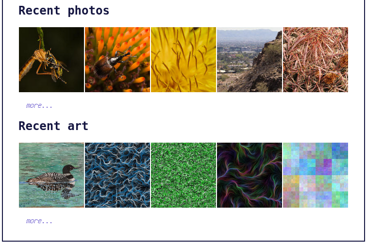
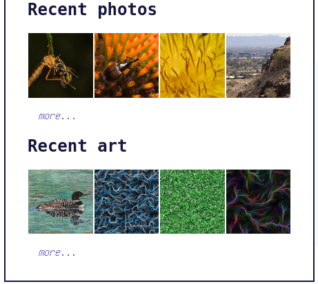
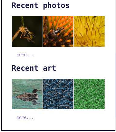
This is done via just a few lines of CSS using the Grid layout. Here they are:
div.gallery-mini {
    display: grid;
    grid-template-columns: repeat(auto-fit, minmax(80px, 1fr));
    grid-template-rows: 1fr 0 0 0 0;
    overflow: hidden;

    img {
        box-sizing: border-box;
        width: 100%;
        border-left: 1px white solid;
        border-right: 1px white solid;
        vertical-align: middle;
    }
}
Div styling
First, the grid columns and rows are built. The grid-template-columns line is the crux of this
problem.
grid-template-columns: repeat(auto-fit, minmax(80px, 1fr));
This line builds the grid columns by auto-fitting each element so that the width is 80px minimum and 1 fraction maximum. That "1 fraction" part means that if there are n images, each image expands to fit 1/n of the total space.
grid-template-rows: 1fr 0 0 0 0;
overflow: hidden;
These two lines allow the grid to span multiple rows, but subsequent rows after the first one are
hidden. This creates the illusion of a variable number of elements. The 1fr height means that the
first row fills all available space in the div. Subsequent rows are not allocated any height.
Image styling
img {
    box-sizing: border-box;
    width: 100%;
    border-left: 1px white solid;
    border-right: 1px white solid;
    vertical-align: middle;
}
I could have used the gap property for spacing between images, but I decided to add
a border and then size around it instead, because it made it easier to exactly fill
the width of the page.
width: 100%;
The cell width is already controlled by the grid-template-columns line above, so we can just
set the image width to 100% to fill its cell.
vertical-align: middle;
This line removes wonky spacing underneath each image, where text descenders would go.
And that's it! There is also some Zola SSG magic to dynamically populate these galleries with images, but that's for another post. You can check out the source code for my site here.